
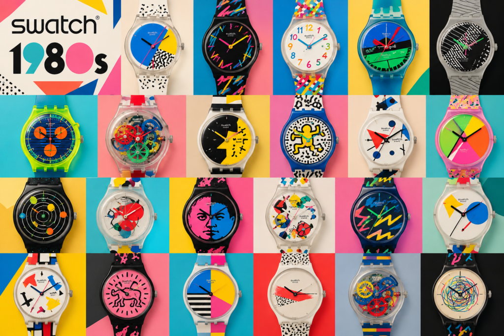
Swatch did not rescue Swiss watchmaking by pretending quartz had never happened. It answered quartz with a watch that was unmistakably Swiss, inexpensive to manufacture and fun enough to buy twice. The first collection reached the market in 1983. Within a few years, Swatch had turned the wrist into a small gallery wall.
The early watches are simple objects: plastic case, quartz movement, printed dial and integrated plastic strap. Their cultural weight came from what Swatch did with that simplicity—rapid design changes, bold marketing and artist collaborations that treated the watch as an edition rather than a permanent catalogue item.
The first 1983 Swatches
Early references such as GN100 show the original idea before the graphics became exuberant. The case is thin, the dial is clean and the whole watch feels deliberately uncomplicated. That restraint matters because it gave later designers a neutral platform to disrupt.
Reference: Swatch Finder: GN100 (1983).
Jellyfish and the appeal of seeing inside
The transparent Jellyfish, designed by Marlyse Schmid and Bernard Müller and released in 1985, made the inexpensive quartz mechanism part of the visual joke. Clear watches now seem familiar, but Jellyfish was startling because it showed how little machinery the case actually needed. Original examples are collectible, yet aged clear plastic often yellows or cracks; photographs taken against a white background reveal more than moody seller images.
Kiki Picasso and the artist-edition model
Swatch’s 1985 collaboration with Kiki Picasso was its first Art Special. Only 140 pieces were produced, each with color variations, which makes authentication far more important than the headline rarity. It also set the pattern for later collaborations: the watch was a “smallest canvas,” sold at the intersection of product design, fashion and accessible art.
Keith Haring’s 1986 designs pushed that idea into a more instantly recognizable graphic language. Their cartoon figures look perfectly at home on a circular dial and remain among the clearest examples of an artist’s work surviving the reduction to wristwatch scale.
Reference: Swatch art-collaboration history.
Pop Swatch and wearing the watch differently
Pop Swatch arrived in 1986 with a large removable watch head that could be clipped into straps or worn as an accessory. It captured the brand’s best instinct: instead of asking how to make a traditional watch more prestigious, Swatch asked how else a watch might be used. Surviving clips, straps and packaging therefore matter to collectors as much as the dial.
How to judge an original 1980s Swatch
- Check the plastic in daylight. Hairline cracks around the lugs and crown are common and hard to reverse.
- Expect strap problems. Original straps can become brittle even when they look unused. A replacement makes the watch wearable but affects originality.
- Listen to the movement. A fresh battery should start the watch promptly; corrosion in the battery compartment is a serious warning.
- Compare the exact reference. Colorways and reissues can be very close. Use Swatch Finder, not memory.
- Do not polish the case. Plastic finishing and printed details are easily damaged.
Original or modern Swatch?
What the 1980s Swatch got right
Swatch made collecting feel social rather than solemn. You could choose one for its dial, swap straps, pin a Pop Swatch to clothing or follow an artist whose work you already liked. The watches were not pretending to be heirlooms, yet the best of them became historical objects anyway. That contradiction is exactly why the originals are still interesting.